Six Herron undergraduate students were chosen from 400 nominees for the 2022 Top 100 Awards. The IUPUI Office of Alumni Relations presents the awards each year to recognize academic excellence, campus leadership, and community engagement.
So, with a series of Q&As, we're shining a light on the accomplishments of Olivia Adam, Teaosha Cunningham, Denver Doub, Jessy Fearnow, Christopher Pack, and Ria Vavhal.
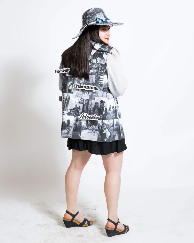
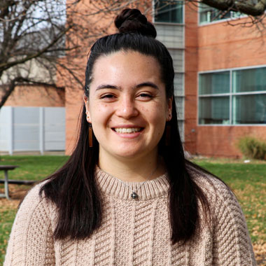
Olivia Adam, from Bremen, Indiana, will graduate this spring with a Bachelor of Fine Arts in visual communication design (VCD). She spoke via email about her capstone project and discussed applying her athletic mindset to her academic and professional endeavors.
HERRON: You identify as "a graphic designer, a varsity rower, and a passionate artist." What compelled you to pursue a career in art and design?
OLIVIA ADAM: I've always been passionate about creativity, and my mom inspired me to continue that path into college. I first wanted to pursue engineering after joining my high school's robotics team, but I later realized I had a strong skill set for design. My role on the robotics team shaped into being the media coordinator creating graphics, running the social media account, and building the website. I really enjoyed doing it, and it inspired me that design can communicate to an audience.
I have a strong personality of selflessness, being reserved, self-awareness, and really understanding people from their shoes. I found graphic design was the perfect match for me to express who I am as an artist and person and make a career out of it.
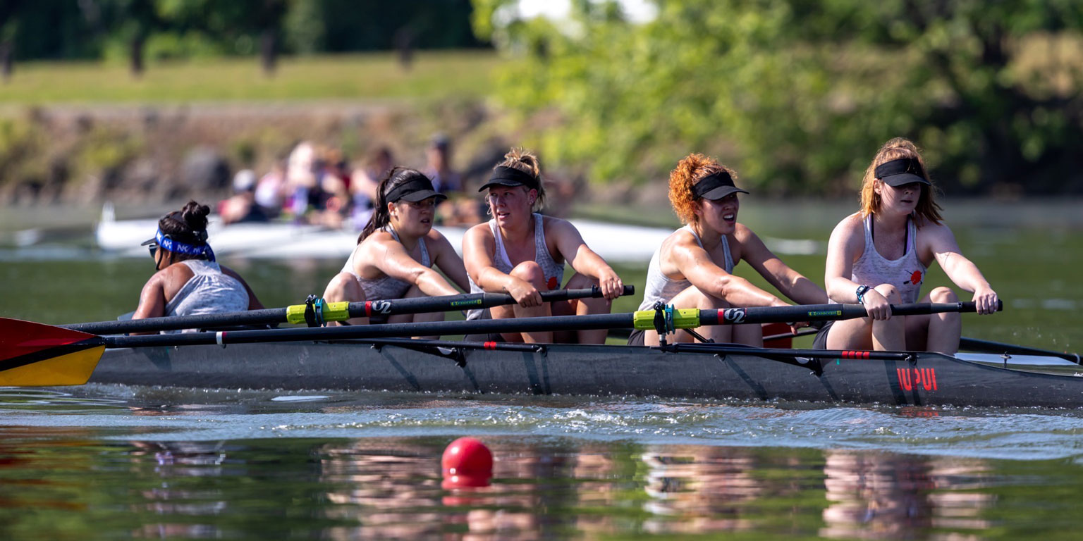
HERRON: You've been a competitive athlete almost your entire life, having competed in swimming, pole vault, gymnastics, soccer, and now rowing with the IUPUI team. What aspects of athletics have shaped you into the dedicated art and design student you are today?
ADAM: I love being active and feeling accomplished both physically and mentally. After doing sports for 18 years, I've concluded that it's just a mental game. Athletics has showed me that success is a process, not an end goal. I must overcome obstacles and challenges, big or small, physically, mentally, and emotionally every day. Being an athlete has taught me that even though I'm facing these challenges, I have my teammates and coaches to lean on and motivate me to keep pushing forward.
I'm grateful for my professors, whom I could lean on for guidance and feedback to grow my problem-solving skills. Being receptive to feedback has been the most crucial skill I've gained from athletics and design. One of the only ways to grow is from feedback because we all make mistakes, and we learn from our mistakes to become stronger and better. I've been setting higher expectations and more challenging goals with all these foundation skills. All my hard work pays off in the end, and there's an end goal waiting to be revealed.
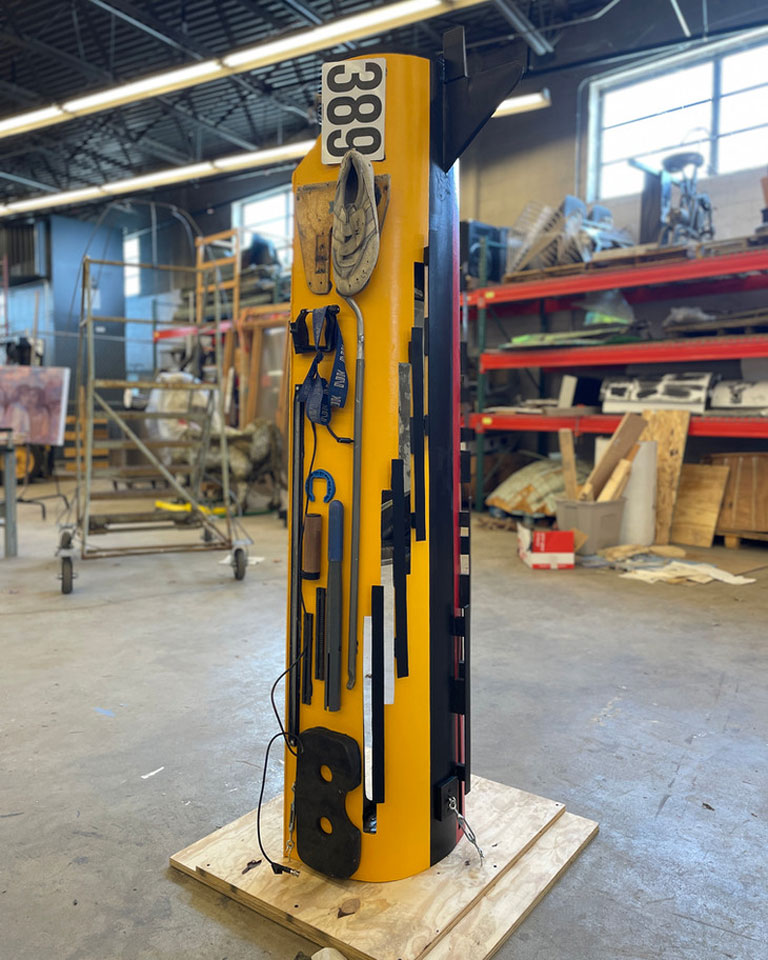
HERRON: Your interest in the arts and athletics were combined to create a collaborative sculpture out of an old racing shell. This project gave birth to "The Crew Effect." Tell us about how the sculpture project inspired the rowing team to do more campus collaborations.
ADAM: "The Crew Effect" has been a dream project. As the current and previous president, I'm always looking for ways to grow the team and find opportunities to spread awareness. IUPUI Rowing is my family and has shaped me into the leader and athlete I am today. In September 2021, the team had a few old racing shells lying around that weren't functional. I didn't want to just throw them away, so I had the idea to create a sculpture. Of course, I didn't want to do it alone and brought my team, Herron, and Dean Greg Hull into the project.
I wanted to collaborate and bring the arts into this great sport. Rowing isn't a prevalent sport because you need a body of water nearby, and it's expensive. I thought this would be a fun project for the team that would push the arts into our surrounding community. My vision was to create a four-sided narrative telling the origin stories of the sport and IUPUI Rowing. The project has become so much more than that. The Crew Effect visually narrates all rowing stories, not just IUPUI's.
The project is scheduled to be completed at the beginning of May. Afterward, the plan is to involve other rowing teams in the project, create a collective rowing story, and spread more awareness of the sport.